

Redesigning an iconic media brand for the web.
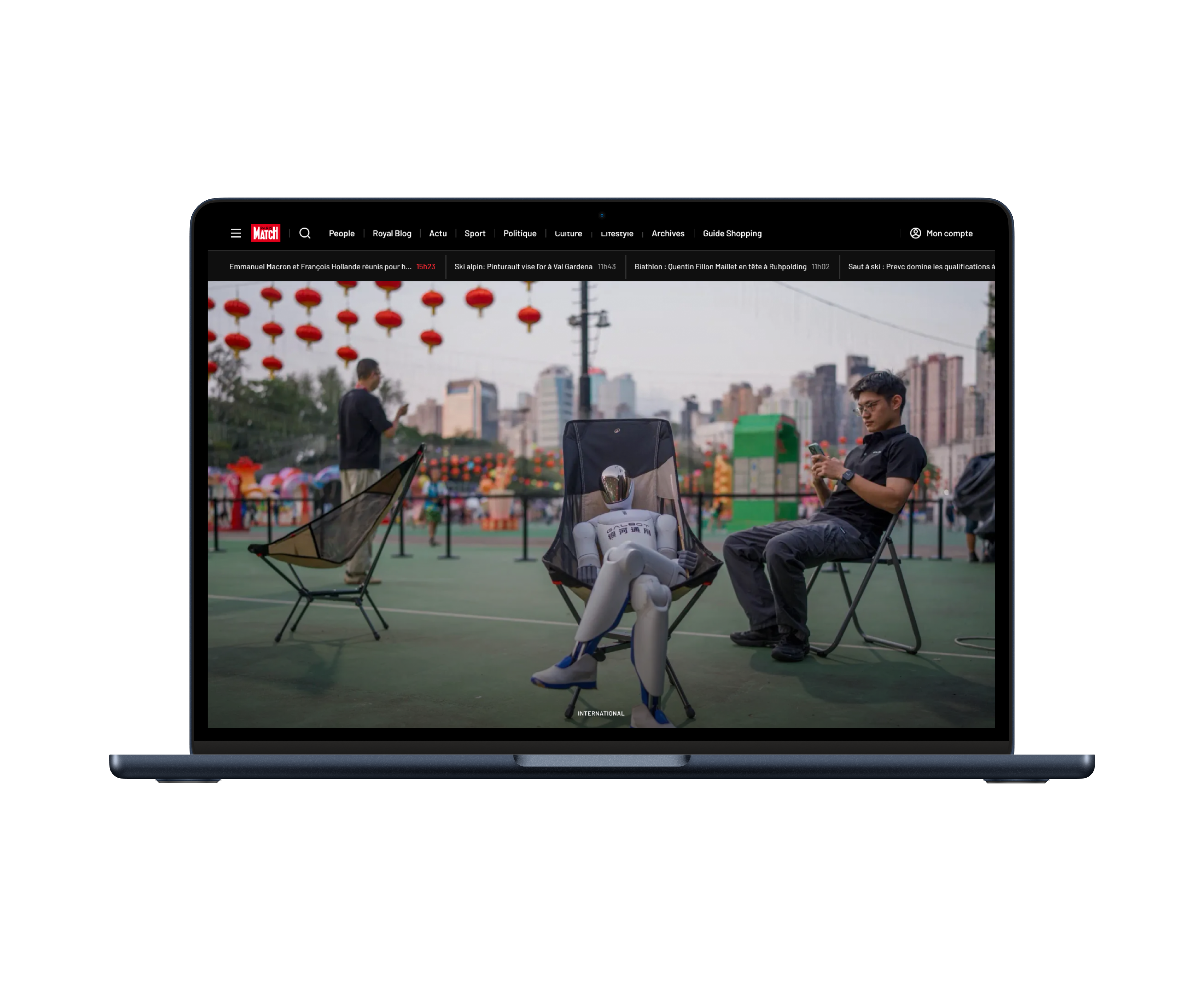
Rethinking Paris Match’s web experience around photography, editorial discovery and conversion, as part of a broader web and app redesign.
Date
2025-2026
My role
Senior Product designer
Scope
Web experience · UX/UI · Design system · Conversion strategy
CONDENSED 1-MINUTE READ
The challenge
Modernize Paris Match’s web experience while preserving its photographic identity, making editorial content easier to discover and creating clearer paths to subscription, app adoption and newsletter sign-up.
My role
Senior Product Designer within a two-designer team, spanning product strategy, UX/UI and design systems. Worked closely with PMs, frontend and CRM developers, editorial teams and business stakeholders to align technical, editorial and business needs.
What I did
Designed editorial layouts, navigation and responsive components, and shaped a conversion strategy tailored to user status and context.
Outcome
A redesigned web experience with a stronger photographic focus, flexible editorial layouts and a reusable design system, aligned with the broader web and app redesign.

CONTEXT
A legendary brand in a changing media landscape
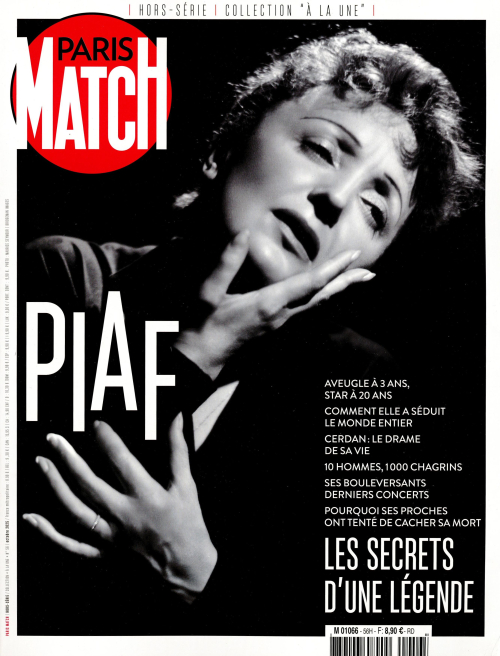
Paris Match’s identity is rooted in powerful photography and storytelling. Its web redesign needed to carry that heritage into an experience serving different reading habits, from browsing breaking news to exploring in-depth stories, while supporting subscriptions and a closer connection with readers.
APPROACH
From constraints to coherence
Building on existing insights and requirements, I worked through the tensions between photographic expression, reading comfort, advertising and conversion.
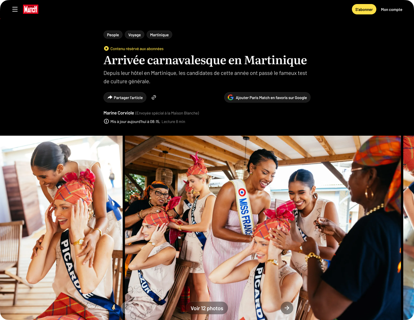
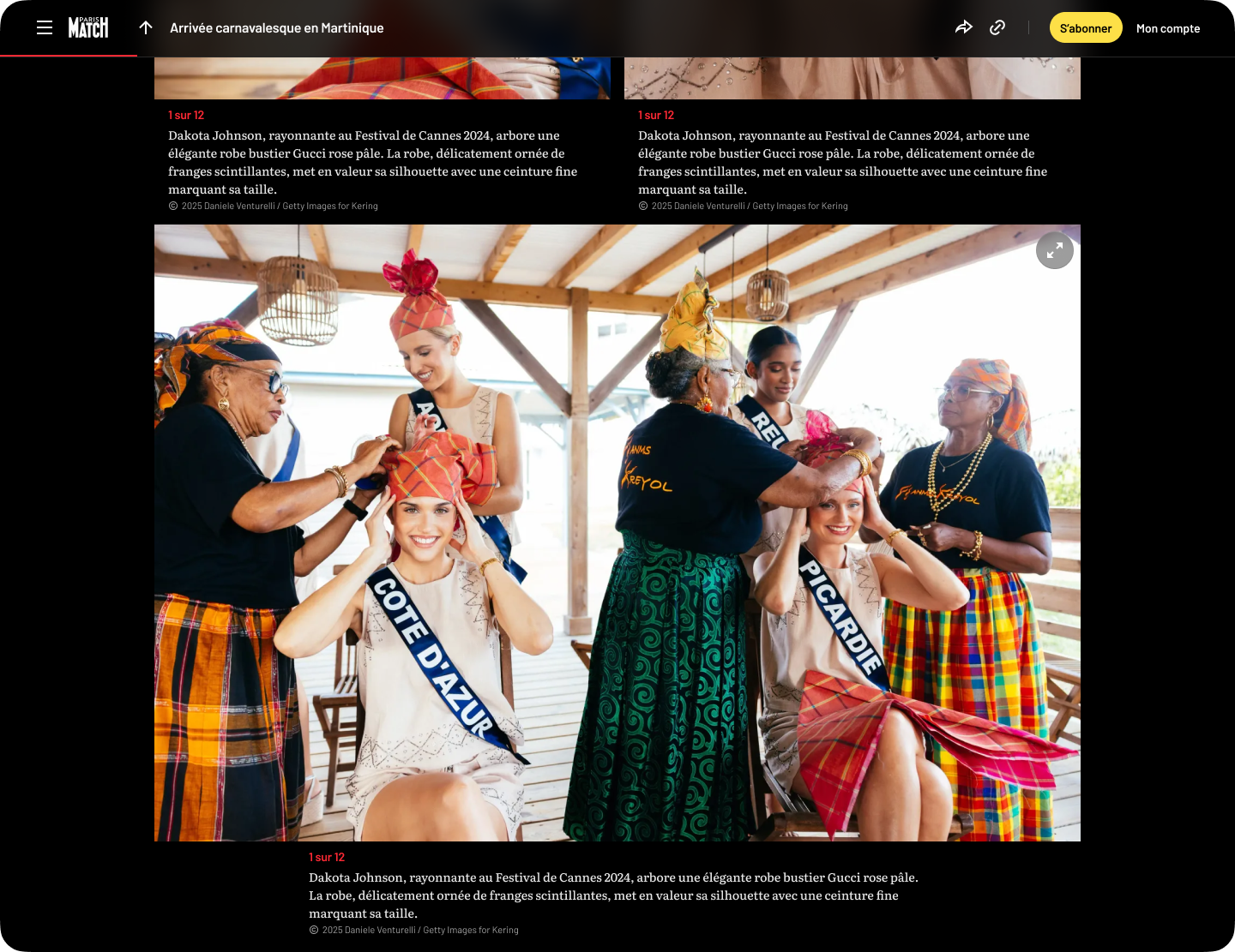
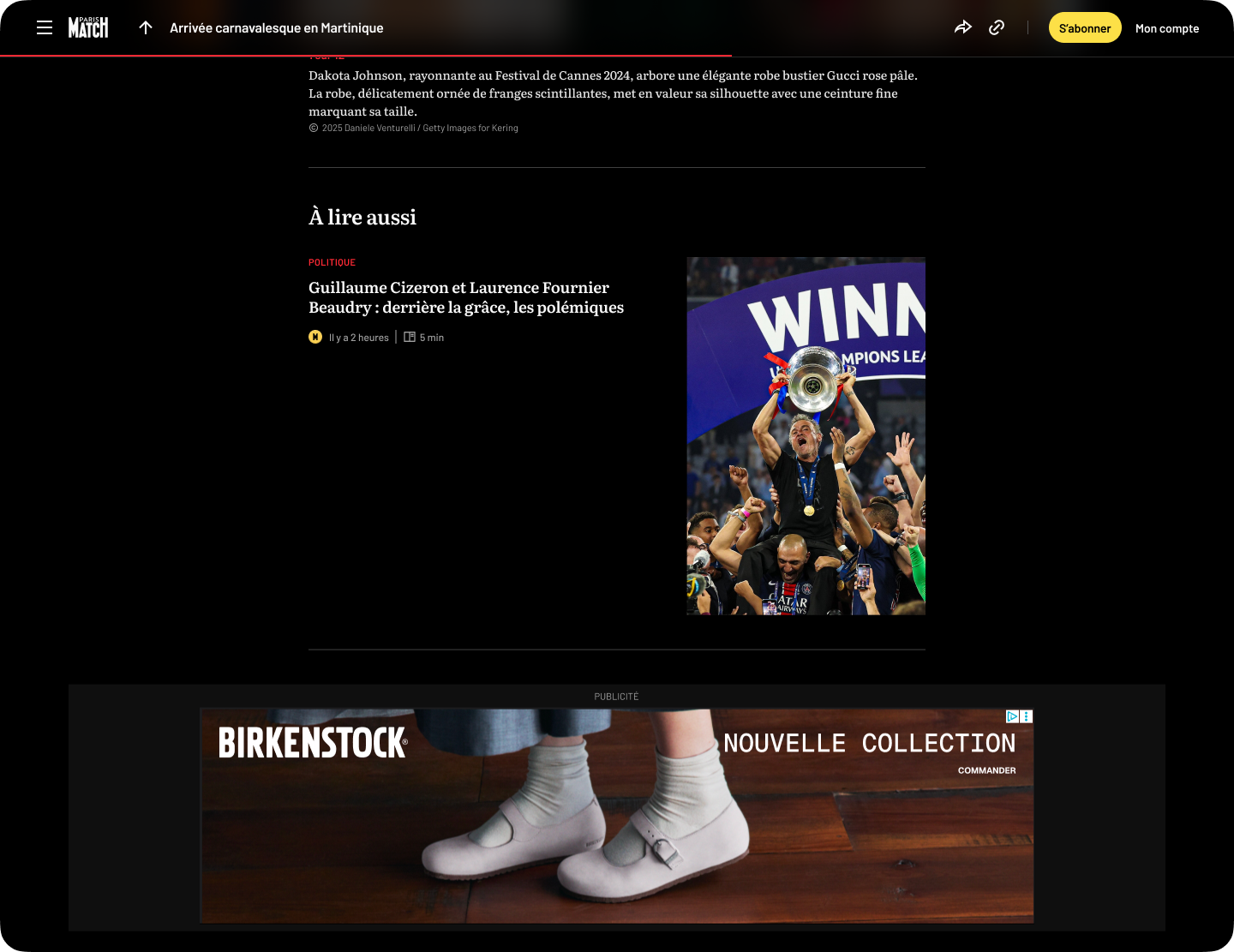
These trade-offs shaped layouts, reusable components and article interactions, including reading progress indicators, contextual navigation and sharing tools. Solutions were refined alongside product, engineering and editorial teams.
Every element competes for attention.
The challenge is deciding what leads, where and when.
CHALLENGE
How do you modernize an icon without losing its identity?
01
Strenghten the photographic identity

02
Make editorial content easier to discover, read and explore
03
Create relevant paths to subscription, app adoption and newsletter sign-up
04
Build a scalable web foundation aligned with the app experience
Conversion strategy
Designing beyond the reading experience.
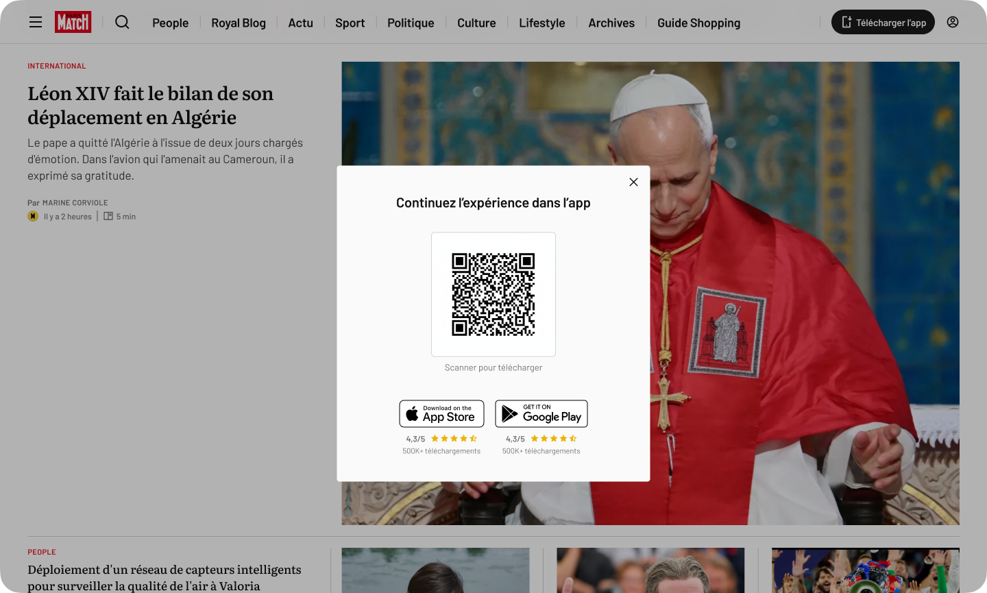
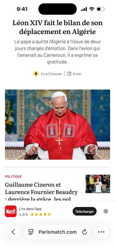
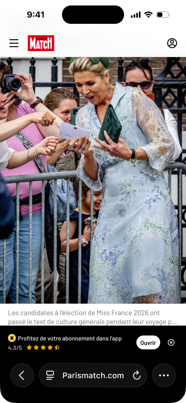
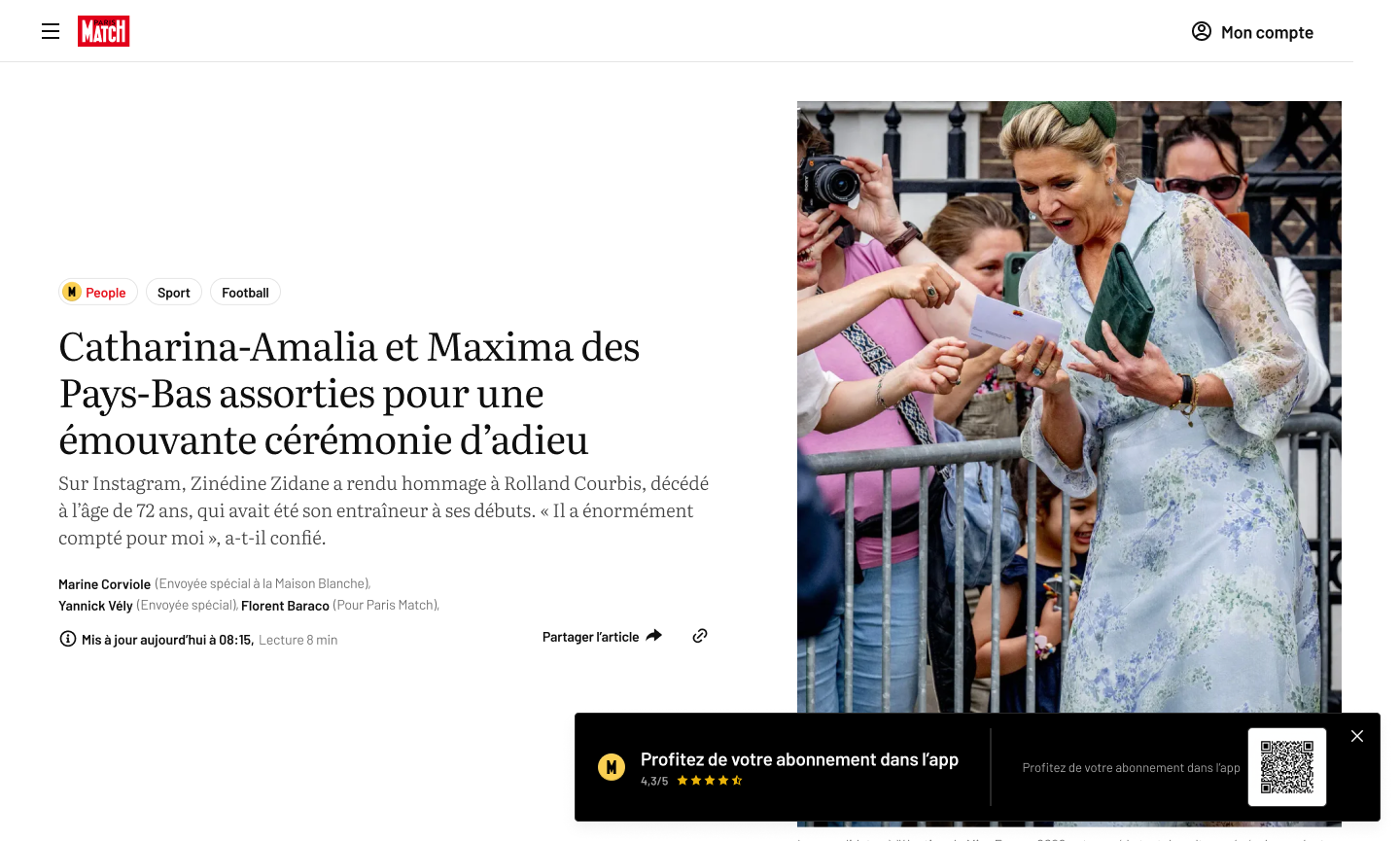
I shaped a site-wide conversion strategy connecting subscriptions, app adoption and newsletter sign-up.
The approach defined which action to prioritise based on the reader’s login and subscription status, their context and their engagement.
These priorities informed user flows, messaging and placement across navigation, banners and modals, balancing business goals with reading comfort.
SOLUTIONS
Photography first
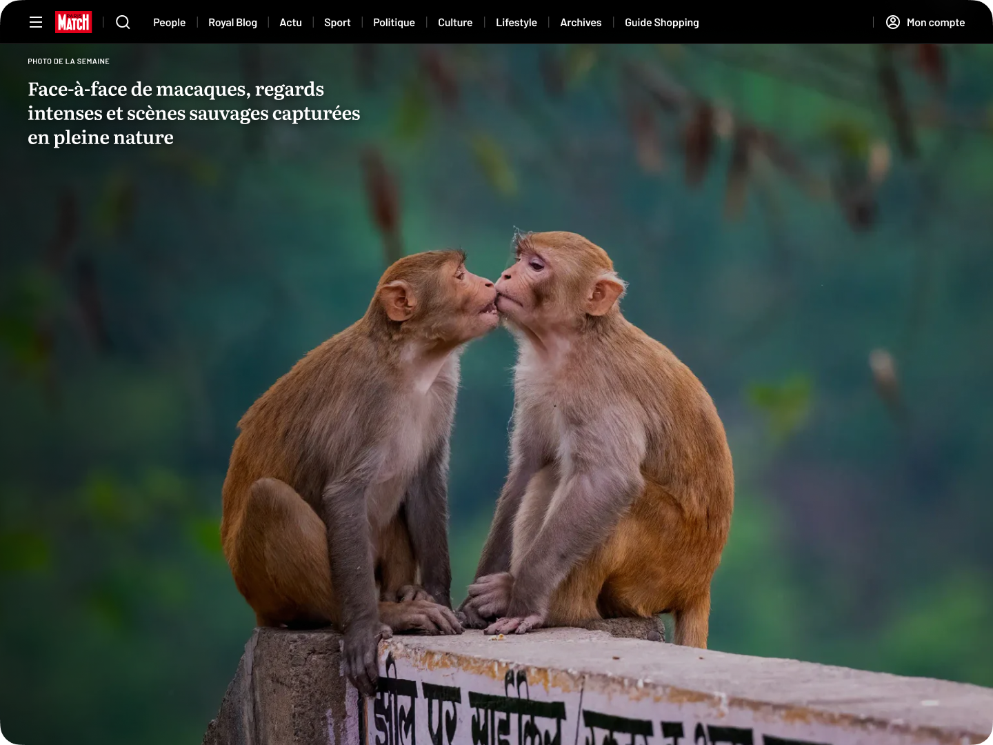
Giving images the space they deserve
Photography became a structural element of the experience, shaping hierarchy, rhythm and storytelling rather than simply illustrating content.
Large photographic openings and varied image formats give stories different levels of prominence, balancing immersive moments with denser editorial layouts.
Design system
Built to adapt
The design system was built to accommodate editorial variety without multiplying bespoke components. Shared structures support different image formats, content densities and advertising needs, with responsive rules defined at component level.
This gives teams the flexibility to compose different editorial layouts while keeping the underlying system consistent and maintainable.
OUTCOMES

A stronger photographic identity
Photography shapes the experience, from prominent story openings to homepage compositions that give visual coverage a leading role.

A flexible editorial experience
Adaptable homepage layouts respond to newsroom priorities, while article navigation and reading cues help readers stay oriented.

A coordinated conversion strategy
Subscription, app adoption and newsletter journeys follow shared priorities, with prompts tailored to reader status and context.

A reusable product foundation
Shared components accommodate varied editorial needs, providing a consistent foundation for future layouts and features.
All design deliverables are complete, with development still underway. The outcomes below reflect the delivered design foundations; their impact on reader engagement and conversion remains to be assessed after launch.


Redesigning an iconic media brand for the web.
Rethinking Paris Match’s web experience around photography, editorial discovery and conversion, as part of a broader web and app redesign.
Date
2025-2026
My role
Senior Product designer
Scope
Web experience · UX/UI · Design system · Conversion strategy
CONDENSED 1-MINUTE READ

The challenge
Modernize Paris Match’s web experience while preserving its photographic identity, making editorial content easier to discover and creating clearer paths to subscription, app adoption and newsletter sign-up.
My role
Senior Product Designer within a two-designer team, spanning product strategy, UX/UI and design systems. Worked closely with PMs, frontend and CRM developers, editorial teams and business stakeholders to align technical, editorial and business needs.
What I did
Designed editorial layouts, navigation and responsive components, and shaped a conversion strategy tailored to user status and context.
Outcome
A redesigned web experience with a stronger photographic focus, flexible editorial layouts and a reusable design system, aligned with the broader web and app redesign.

CONTEXT
A legendary brand in a changing media landscape
Paris Match has built its identity around powerful photography and storytelling for decades. As reading habits and media consumption evolved, its digital experience needed to evolve too, without losing the visual and editorial character that makes the brand instantly recognizable.
APPROACH
From constraints to coherence
Building on existing insights and requirements, I worked through the tensions between photographic expression, reading comfort, advertising and conversion.
These trade-offs shaped layouts, reusable components and article interactions, including reading progress indicators, contextual navigation and sharing tools. Solutions were refined alongside product, engineering and editorial teams.
Every element competes for attention.
The challenge is deciding what leads, where and when.
CHALLENGE
How do you modernize an icon without losing its identity?
01
Strenghten the photographic identity

02
Make editorial content easier to discover, read and explore
03
Create relevant paths to subscription, app adoption and newsletter sign-up
04
Build a scalable web foundation aligned with the app experience
Conversion strategy
Designing beyond the reading experience.
I shaped a site-wide conversion strategy connecting subscriptions, app adoption and newsletter sign-up.
The approach defined which action to prioritise based on the reader’s login and subscription status, their context and their engagement.
These priorities informed user flows, messaging and placement across navigation, banners and modals, balancing business goals with reading comfort.
A flexible editorial system
One system.Different rythms.
Working closely with editorial and CMS development teams, I translated newsroom needs into flexible homepage compositions while the CMS was still being built.
The resulting hero supports two editorial modes: a photo-led presentation for events and visual stories, and a multi-story layout for broader news coverage. Both share the same design foundations, allowing the homepage to reflect changing editorial priorities.

DRAG TO PREVIEW
SOLUTIONS
Photography first
Giving images the space they deserve
Photography became a structural element of the experience, shaping hierarchy, rhythm and storytelling rather than simply illustrating content.
Large photographic openings and varied image formats give stories different levels of prominence, balancing immersive moments with denser editorial layouts.
Design system
Built to adapt
The design system was built to accommodate editorial variety without multiplying bespoke components. Shared structures support different image formats, content densities and advertising needs, with responsive rules defined at component level.
This gives teams the flexibility to compose different editorial layouts while keeping the underlying system consistent and maintainable.
OUTCOMES
A stronger photographic identity
Photography shapes the experience, from prominent story openings to homepage compositions that give visual coverage a leading role.
A flexible editorial experience
Adaptable homepage layouts respond to newsroom priorities, while article navigation and reading cues help readers stay oriented.
A coordinated conversion strategy
Subscription, app adoption and newsletter journeys follow shared priorities, with prompts tailored to reader status and context.
A reusable product foundation
Shared components accommodate varied editorial needs, providing a consistent foundation for future layouts and features.
All design deliverables are complete, with development still underway. The outcomes below reflect the delivered design foundations; their impact on reader engagement and conversion remains to be assessed after launch.
Get in touch 👋

CONTACT
(+33) 6 11 12 13 64
anthony@luccini-cots.com
LOCATION
PARIS, FRANCE
Redesigning an iconic media brand for the web.
Rethinking Paris Match’s web experience around photography, editorial discovery and conversion, as part of a broader web and app redesign.
Date
2025-2026
My role
Senior Product designer
Scope
Web experience · UX/UI · Design system · Conversion strategy
CONDENSED 1-MINUTE READ
The challenge
Modernize Paris Match’s web experience while preserving its photographic identity, making editorial content easier to discover and creating clearer paths to subscription, app adoption and newsletter sign-up.
My role
Senior Product Designer within a two-designer team, spanning product strategy, UX/UI and design systems. Worked closely with PMs, frontend and CRM developers, editorial teams and business stakeholders to align technical, editorial and business needs.
What I did
Designed editorial layouts, navigation and responsive components, and shaped a conversion strategy tailored to user status and context.
Outcome
A redesigned web experience with a stronger photographic focus, flexible editorial layouts and a reusable design system, aligned with the broader web and app redesign.

CONTEXT
A legendary brand in a changing media landscape
Paris Match’s identity is rooted in powerful photography and storytelling. Its web redesign needed to carry that heritage into an experience serving different reading habits, from browsing breaking news to exploring in-depth stories, while supporting subscriptions and a closer connection with readers.
CHALLENGE
How do you modernize an icon without losing its identity?
01
Strenghten the photographic identity

02
Make editorial content easier to discover, read and explore
03
Create relevant paths to subscription, app adoption and newsletter sign-up
04
Build a scalable web foundation aligned with the app experience
APPROACH
From constraints to coherence
Building on existing insights and requirements, I worked through the tensions between photographic expression, reading comfort, advertising and conversion.
These trade-offs shaped layouts, reusable components and article interactions, including reading progress indicators, contextual navigation and sharing tools. Solutions were refined alongside product, engineering and editorial teams.
Every element competes for attention.
The challenge is deciding what leads, where and when.
SOLUTIONS
Photography first
Giving images the space they deserve
Photography became a structural element of the experience, shaping hierarchy, rhythm and storytelling rather than simply illustrating content.
Large photographic openings and varied image formats give stories different levels of prominence, balancing immersive moments with denser editorial layouts.
A flexible editorial system
One system.Different rythms.
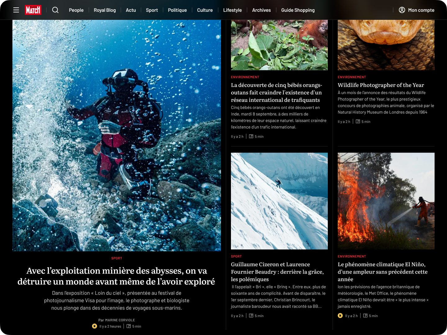
Working closely with editorial and CMS development teams, I translated newsroom needs into flexible homepage compositions while the CMS was still being built.
The resulting hero supports two editorial modes: a photo-led presentation for events and visual stories, and a multi-story layout for broader news coverage. Both share the same design foundations, allowing the homepage to reflect changing editorial priorities.
DRAG TO PREVIEW
Conversion strategy
Designing beyond the reading experience.
I shaped a site-wide conversion strategy connecting subscriptions, app adoption and newsletter sign-up.
The approach defined which action to prioritise based on the reader’s login and subscription status, their context and their engagement.
These priorities informed user flows, messaging and placement across navigation, banners and modals, balancing business goals with reading comfort.
Design system
Built to adapt
The design system was built to accommodate editorial variety without multiplying bespoke components. Shared structures support different image formats, content densities and advertising needs, with responsive rules defined at component level.
This gives teams the flexibility to compose different editorial layouts while keeping the underlying system consistent and maintainable.
OUTCOMES

A stronger photographic identity
Photography shapes the experience, from prominent story openings to homepage compositions that give visual coverage a leading role.
A flexible editorial experience
Adaptable homepage layouts respond to newsroom priorities, while article navigation and reading cues help readers stay oriented.
A coordinated conversion strategy
Subscription, app adoption and newsletter journeys follow shared priorities, with prompts tailored to reader status and context.
A reusable product foundation
Shared components accommodate varied editorial needs, providing a consistent foundation for future layouts and features.
All design deliverables are complete, with development still underway. The outcomes below reflect the delivered design foundations; their impact on reader engagement and conversion remains to be assessed after launch.

Get in touch 👋
CONTACT
(+33) 6 11 12 13 64
anthony@luccini-cots.com
LOCATION
PARIS, FRANCE